CLIENT
TIMELINE
ROLE
Challenge
Customers have multiple touch points in order to view, manage, and take action on their accounts. Their experience has become fragmented and inefficient.
Solution
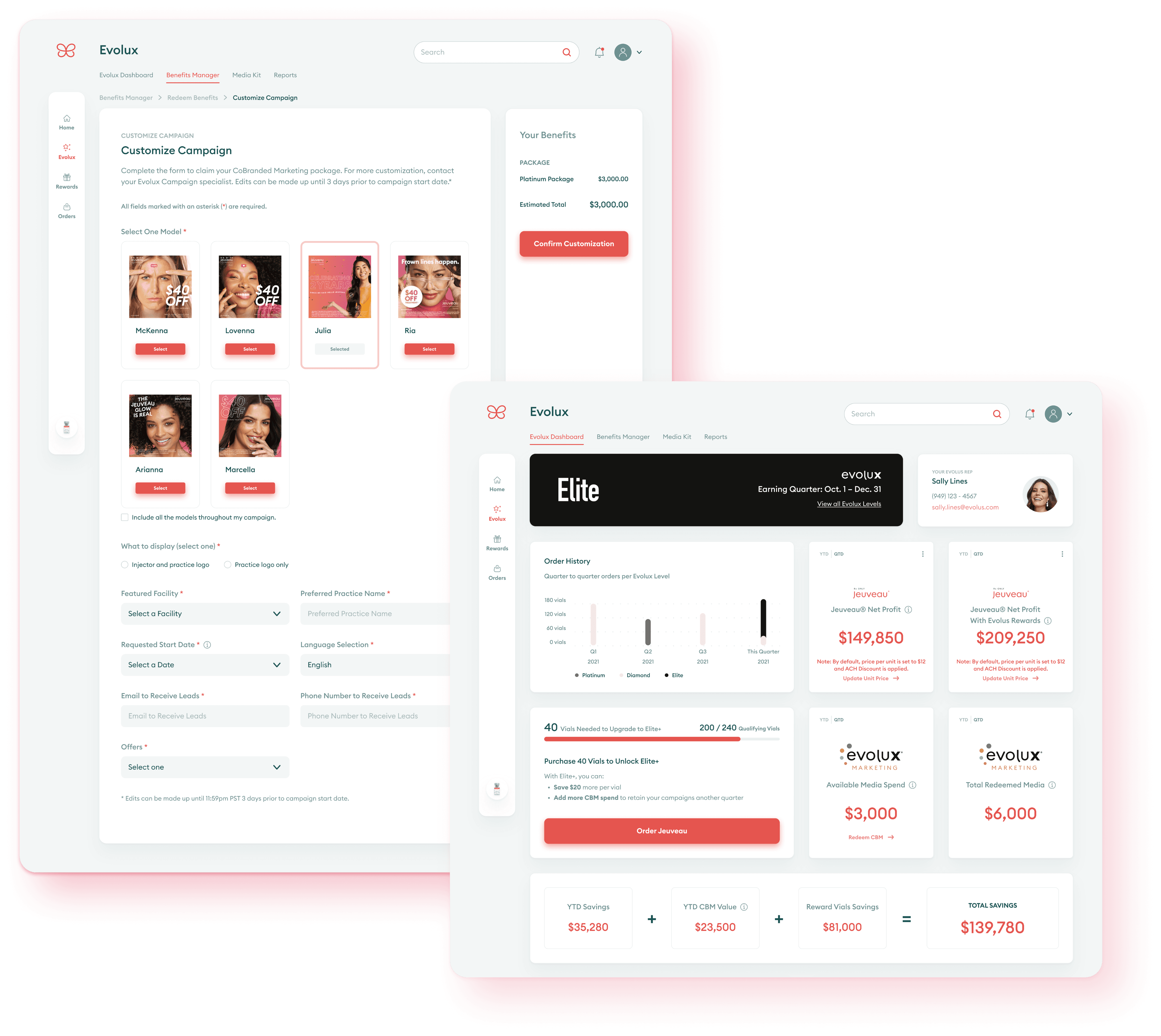
Evolus Portal is a self-serve web application that consolidates our current digital offerings with expanded functionality.
Impact
Customers now have much more autonomy over their account while sales reps can focus on building accounts and converting leads.
Define
To start, we wanted this new product to have parity with our existing apps while allowing for future functionality.
Background
At launch, the vision for our customers’ digital experience was a mobile-first approach. In the native mobile app, customers had the ability to order, manage payments, view order history, and view their loyalty status.
There was also a web app for checking in patients to our Evolus Rewards program and primarily used by the receptionist at facilities.
The recent addition of our customer loyalty program (Evolux) allows customers to earn benefits, however, there was no easy way to redeem those benefits. Account reps were required for benefits redemption, and while they provided a white-glove service, reps were unable to support larger accounts and convert new leads.
Orders (native mobile app)
Rewards (web app)
Evolux customer loyalty program (Salesforce Lightning)
Ideate
We paired with Dtail Studio, a creative agency, to kickstart the process for rebranding which coincided with this project.
Option 1
Option 2
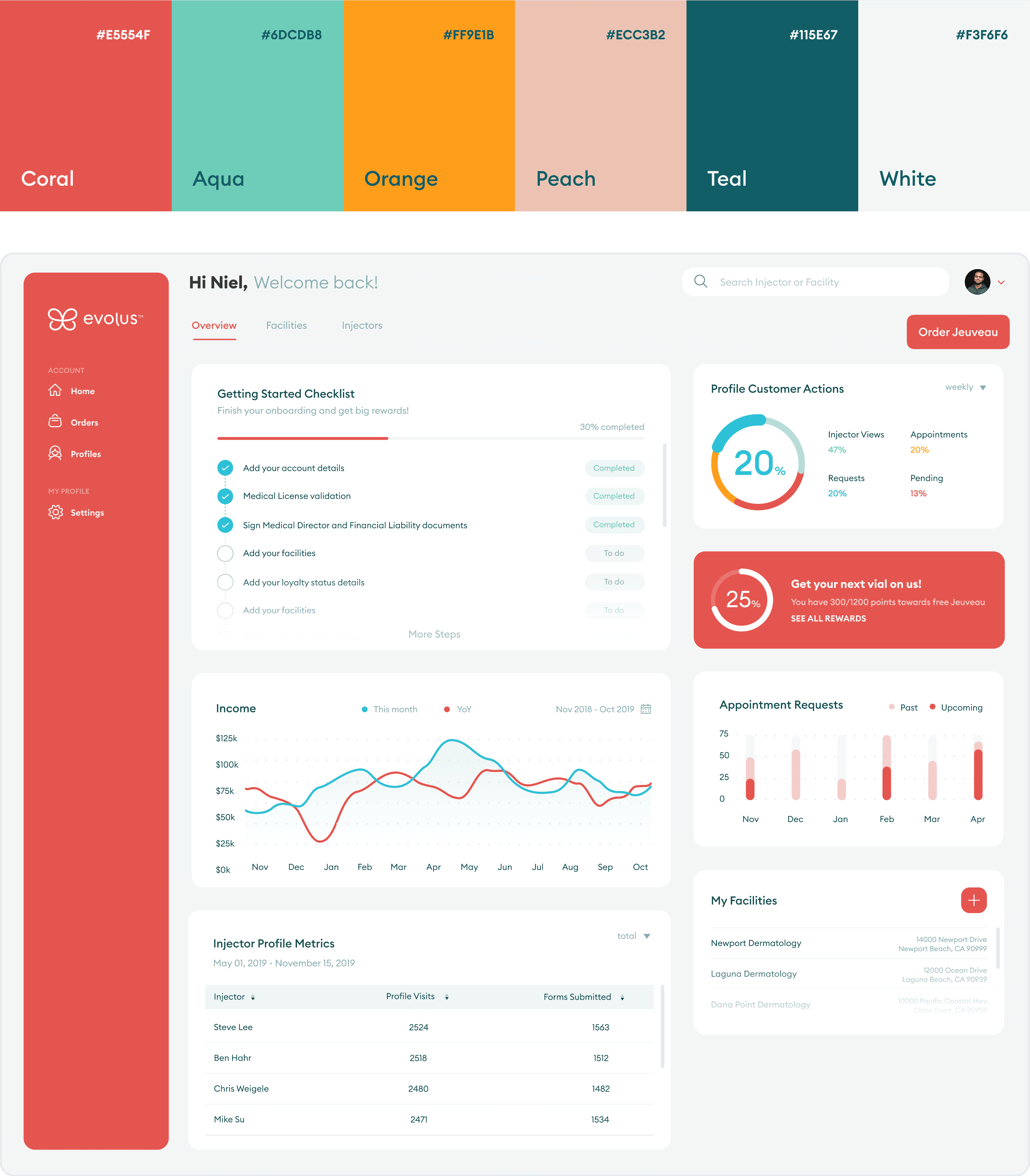
After collaborating with Marketing, we moved forward with option 1’s minimalism and option 2’s branding.
Portal
I designed existing functionality in the Portal and made space for additional future features.
Orders
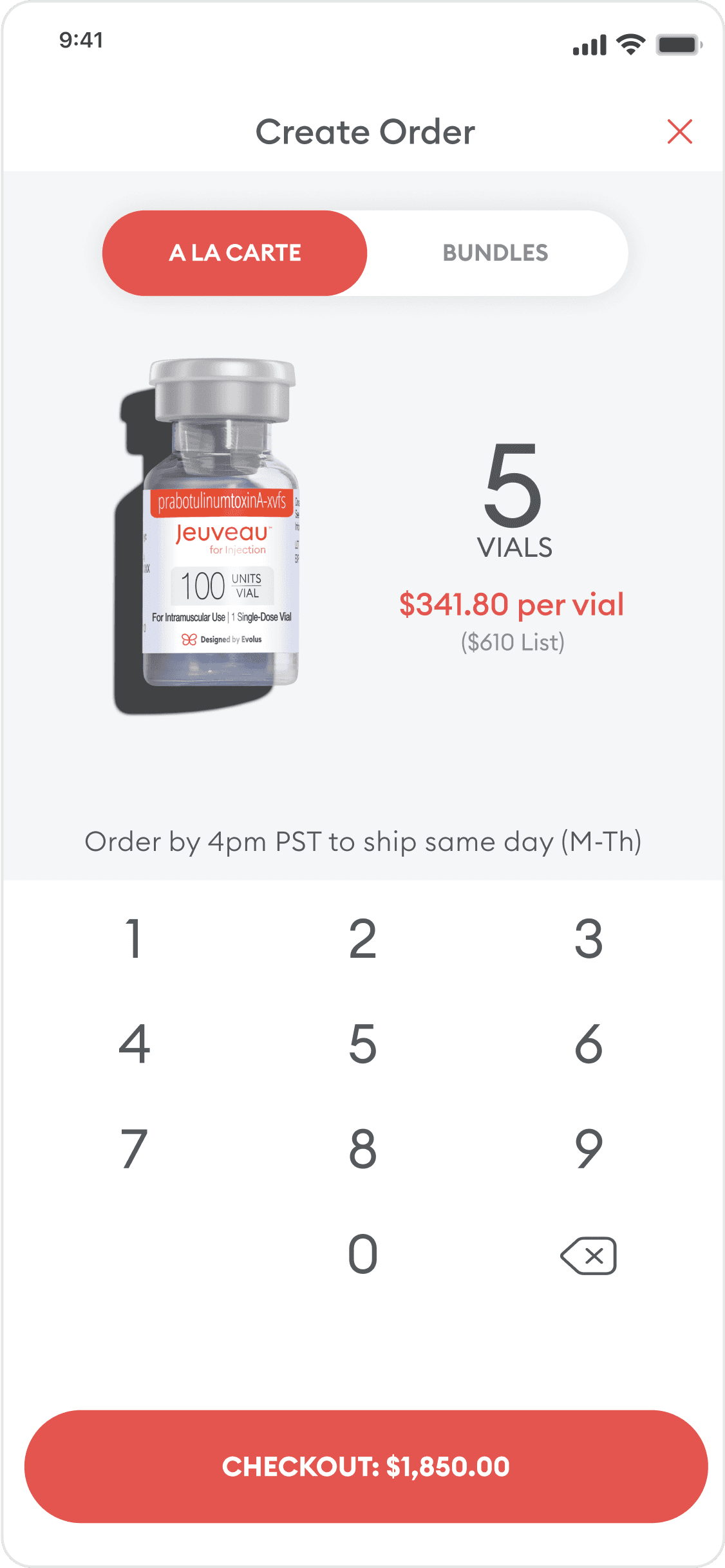
Customers could now order directly in the Portal on any device as well as use the existing Practice app to conveniently place orders and view order history.
Rewards
Practices could easily check in patients and view upcoming patient rewards without having to open up a different app.
Evolux customer loyalty program
The newest Evolus experience was now accessible on the Portal where customers could view details about their status and even redeem benefits on their own.
“
Design system
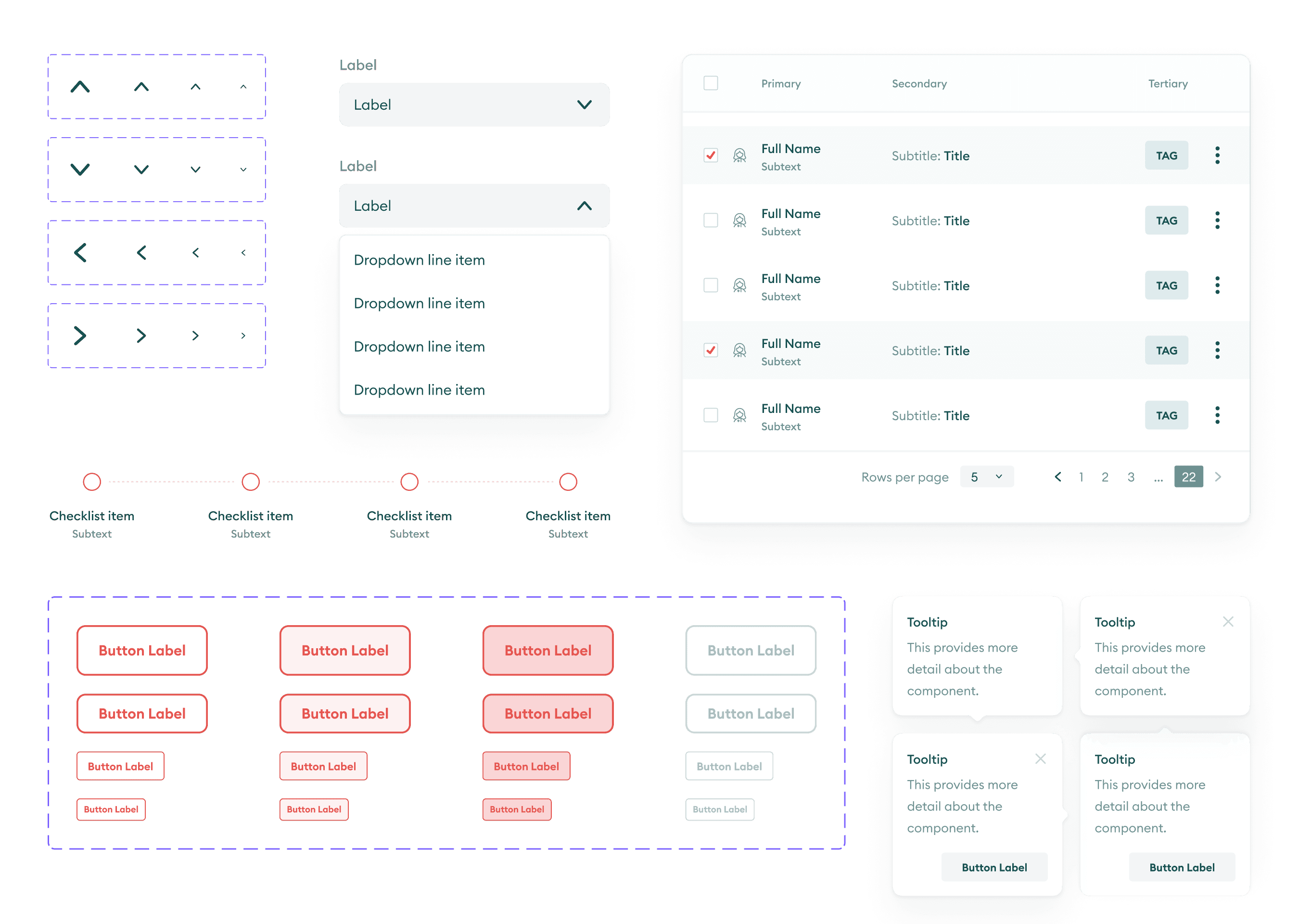
In tandem with the Portal, I created a new design system to allow designers to scale efficiently and realize company initiatives.
Support
Leadership understood the importance of creating a unifying experience for our users, and the Portal provided us with a new platform to stress test the system.
Build
I gathered inspiration from existing design systems, Dtail Studio’s original explorations, and current applications to build components for the Portal.
Champions
The Portal was evidence of the importance of a design system. We delivered in half the expected time while also ensuring consistency and creating a foundation for future improvements and increased functionality.
Reflection
The time granted for explorations and conceptual work was vital for this project. The Portal has been a wild success by consolidating fragmented digital experiences into one tool to support both sales reps and customers alike. Additionally, it has even more expanded functionality today (2024) since its creation 3 years ago.
While the Portal was the primary deliverable, creating a solid design system from scratch was equally as important. Not only did it allow me to become more confident in learning Figma’s auto-layout feature, create new patterns while conceptualizing, and also figure out when to break the system, but future designers now have the space to be creative while delivering efficiently. I left the company before I could add proper documentation and guidelines.
