CLIENT
TIMELINE
ROLE
CHALLENGE
Coaches and therapists have to inefficiently sort through 5+ different systems to find, learn, and share care content to members (digital exercises, handouts, and library content).
SOLUTION
We launched a repository for all digital content at Brightline within our internal provider tool. Users can filter, favorite, preview, and quick assign content all in one place.
IMPACT
The Content Discoverability tool ignites engagement to better enable care, increases provider productivity, and unlocks multiple company initiatives.
Define
Problem
Discovering, searching, and sharing this Brightline content is inefficient for coaches and therapists (providers): the inventory for care content is located in a Google Sheet, videos explaining each exercise can be found in a shared Google Drive, and previewing content takes several clicks.
They tend to rely on trusted 3rd-party content because that’s easy and familiar.
Approach
After conducting a few user research sessions with providers, I really empathized with the interrupted and tedious workflows just to discover new content. How could we boost provider happiness while also supporting business initiatives?
5
42%
10-15
Objectives
We defined three main objectives:
Enable more effective content engagement
Improve care team satisfaction
Increase workflow efficiency
Priorities
User research sessions helped us prioritize what was needed:
1.
A ‘one-stop shop’ for all digital content
2.
An easy way for coaches and therapists to preview and assign
3.
Embed solution into existing clinical workflows
Ideate
Initial wireframe exploration
We included a filter to account for various criteria due to the variability in workflows and types of content.
To encourage additional discovery, we added a preview functionality and the ability to “favorite” their go-tos for easy access.
Filters and Favorites
Almost weekly sessions with our users helped to shape, inform, test, and ultimately champion the designs with their peers.
Final design - Content Discovery repository
Final design - Preview
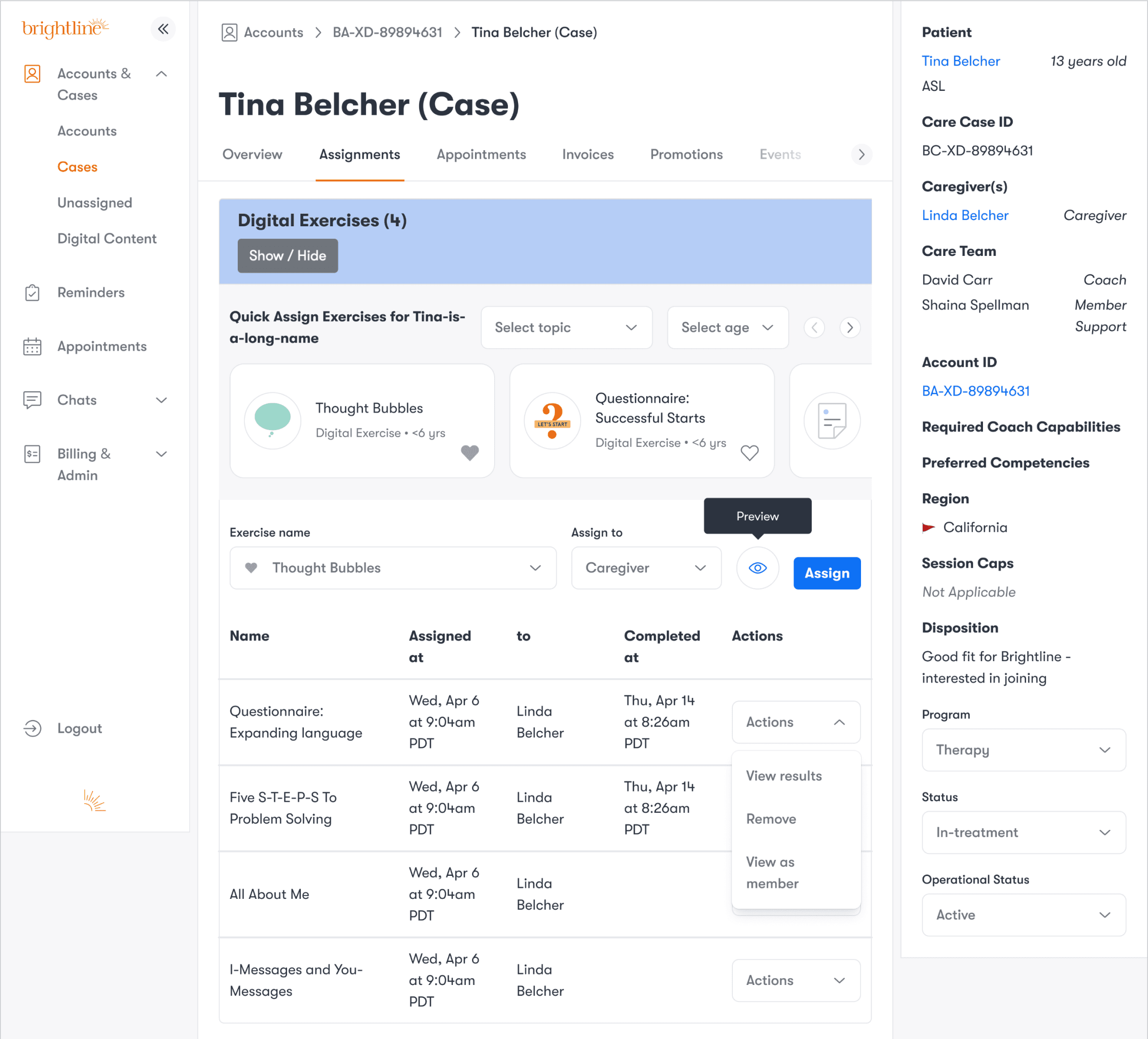
In addition to the repository, we embedded a quick assign feature to existing workflows on other pages.
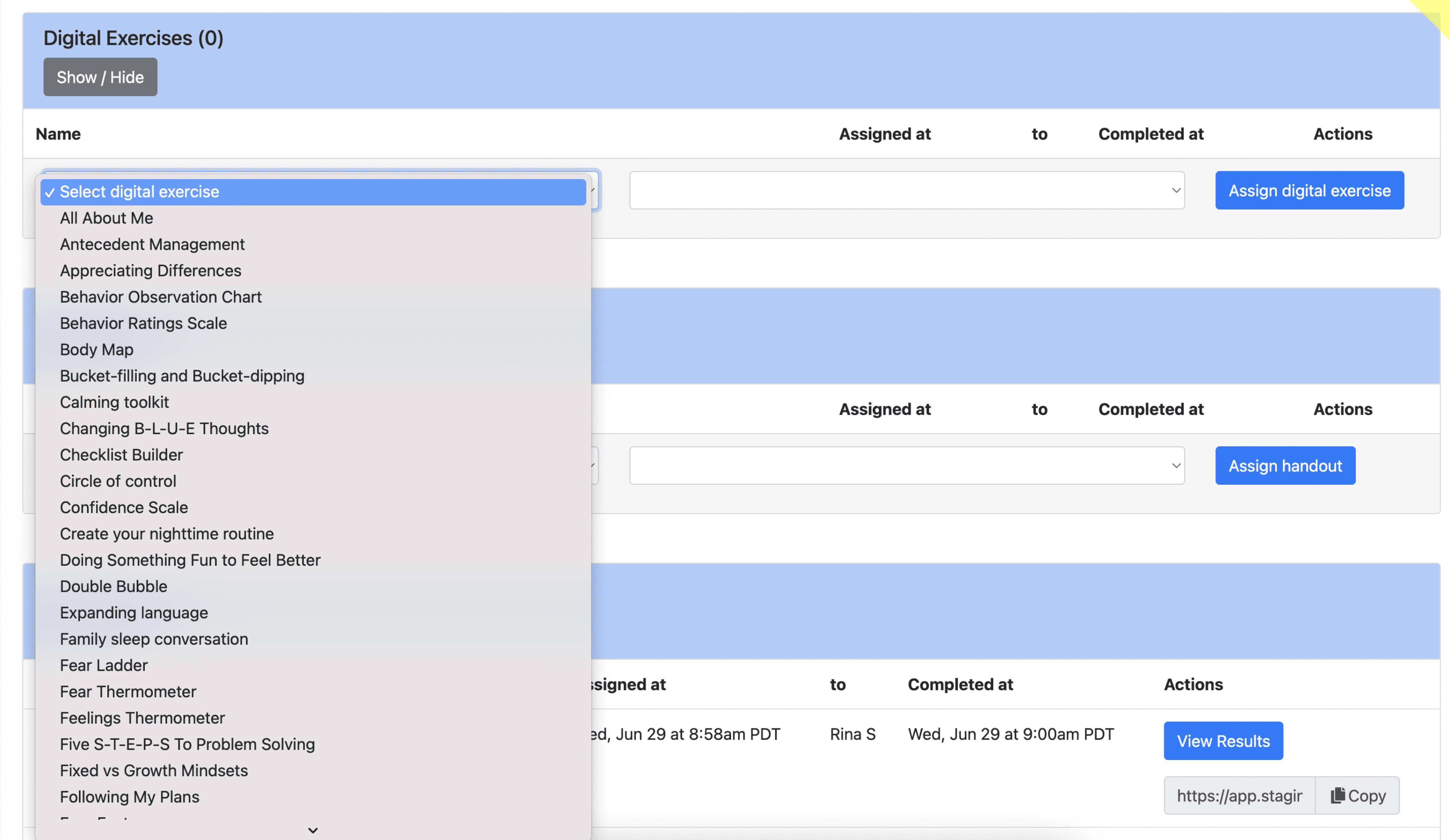
Original design - Assign Digital Exercises from dropdown
Final design - Quick assign Digital Exercises
Prototype

“
— Member support specialist
Juggling dev time and our launch date, we ultimately removed some “nice to have” design components to prioritize functionality but kept a backlog of future improvements for when we had more time.
Reflection
This was a net new feature which excited providers to make content discovery easier, more streamlined, and faster. With the increase in efficiency gained and unlocking business initiatives to provide better care, it seemed like a win-win!
Some months later when conducting research for another project, however, that palpable excitement had fizzled. Coaches weren’t aware we even had this repository and wished there was a ‘one-stop shop.’ Was all our hard work in vain? As disappointed as I was, I realized we needed continuous championing of these efforts or else providers would revert back to their complicated workflows.
With a recent EHR migration, however, we embedded parts of this tool directly into the the clinical note as an iFrame. This placement was critical for therapists to increase their use our tooling.


