Brightline
2 Weeks
[Collaborated with Product, Marketing, Engineering, UX research]
Challenge
Member communications have become fragmented, with emails varying in visual style and lacking brand cohesion. This inconsistency risks losing member trust and increasing unsubscribe rates.
Solution
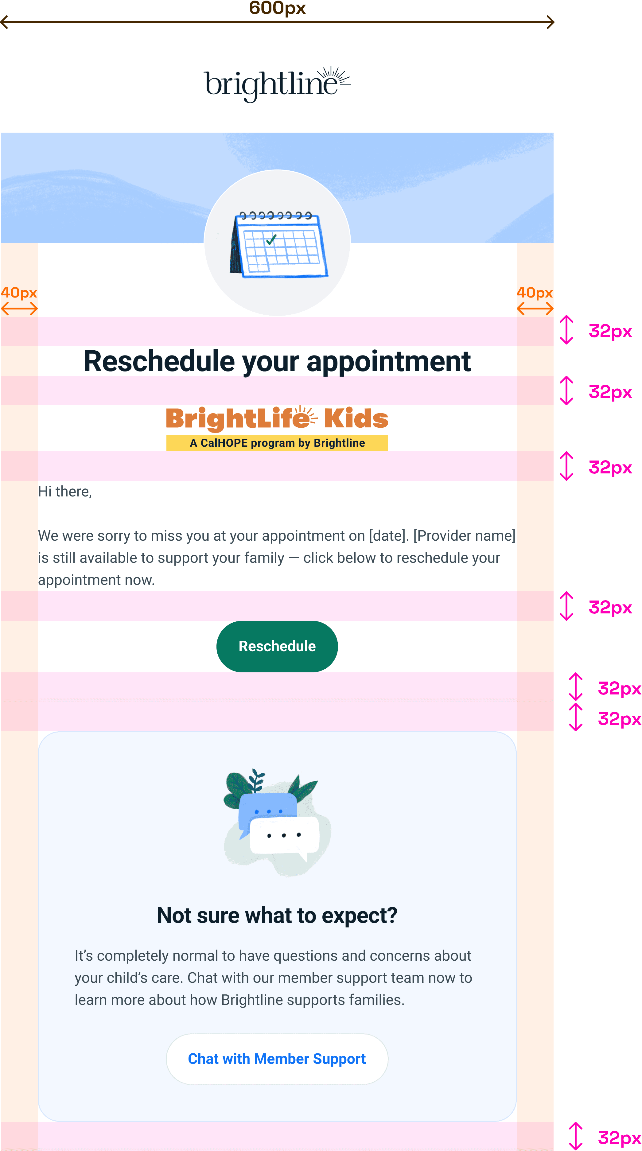
We defined clear guidelines and created templates that would streamline the creation of future emails with a consistent and unified visual style.
Impact
Designers and engineers can quickly create emails with stronger brand trust and a more seamless, recognizable member experience.
Define
Internally as a team, we admitted our emails were all over the place. How could we operate successfully as a business if our member comms looked like they were from different companies?
What we were working with
We opted for a phased approach, prioritizing some quick visual design wins and marketing emails. Subsequent phases included migrating some of our technology to one tool and broader visual updates.
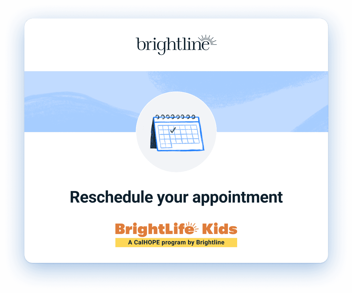
To add to the confusion, members of BrightLife Kids (a CalHOPE program by Brightline) receive emails from both BrightLife Kids and Brightline, but it’s not clear in those emails that the two entities are associated.
Ideate
This wasn’t on any official roadmap, so we prioritized the header and layout rather than update the content in each email.
QA
Before
After
Reflection
This took a little longer to implement than expected given it wasn’t a true item on the roadmap, but I’m so proud of the team that made the time to push this forward in their free time.
Unfortunately I left the company before I got a chance to hear about and see any meaningful change in the impact of these redesigned emails. Hopefully members of BrightLife Kids will now recognize Brightline as part of the CalHOPE program and not unsubscribe.


